Show Posts

This section allows you to view all posts made by this member. Note that you can only see posts made in areas you currently have access to.


Messages - DDR

Pages: 1 ... 3 4 [5] 6 7 8
61
Software Dev / Updating the UI: Battery
« on: July 18, 2018, 08:56:40 PM »
On the redesigned main screen, if you tap the battery icon, you'll get to a screen for battery and power. As with most of my mockups, this comes with a caveat: this is what we want. This is not necessarily what we'll get. ;)


62
Chronos User Discussion / Re: Protecting the Chronos
« on: July 03, 2018, 06:22:22 PM »
Man - I just gotta say, that's some beautiful footage! 8)

63
Hi Fritze! The fastest way to get data from the ring buffer to NVM is to grab the latest beta, set it to auto-save after recording if you want all the recorded data, and use a class 10 SD card or faster to save mp4-encoded video. Saving is bottlenecked by CPU RAM access speed at the moment, so there's not a lot we can do to work around it right now. You should see save speeds around 60fps for full resolution video, if I recall correctly. :)

All the best,
–DDR

64
Chronos User Discussion / Re: Acceleration/g-force rating
« on: June 12, 2018, 03:31:38 PM »
Hm, we've hit one with a baseball bat pretty hard and it kept working, but we don't know what the actual g-force rating is. (We've got plans to actually find this out, but we haven't built the test rig we need for the lawnmower yet.) I'd imagine you could accelerate quite quickly with it, but… uh, let us know what you find? :D

65
Software Dev / Re: Updating the UI: Input Methods Edition
« on: June 06, 2018, 01:50:31 PM »
Oh man - I hadn't seen that thread! What a lot of good feedback and ideas. :D

Thank you for linking, rnighting!

66
Software Dev / Re: Deploying camApp from Qt Creator
« on: May 16, 2018, 01:55:38 PM »
Hm, I don't think you're going to get more than a couple percent by shutting down the additional threads. I think they're pretty light. I think the display doesn't actually eat any appreciable processing power either, if you're not interacting with it. :-\

I myself would be tempted to look at algorithmic improvements. Sampling fewer pixels, or sampling less often, that sort of thing. I don't know how you've implemented the light detection, though, or really what the bottleneck is there. (I mostly do graphical design work.)

I almost wonder if an led with some sort of amplifier circuit could work as a pluggable trigger. I'm pretty sure one could be constructed for a few bucks in parts, according to the Instructable I found. I don't know your specific use-case though so I can't really offer much usable advice on that front, I think. If you had something else, another camera say, with a light sensor and the ability to output a trigger signal, you could use that as well.

As a side note, sudden light-level changes would probably be a great thing for us to be able to trigger on in general. Sound too. It's theoretically possible… It would be very nice to have built-in.


Whatever happens, best of luck Maja!

67
Software Dev / Re: Software V0.3 Beta - Updated Jan 4 2018
« on: April 30, 2018, 08:01:15 PM »
Our current plan is to release the upcoming version of the software, 0.3, on Wednesday. "For real this time. We swear." We've been testing the new version internally, which has led to some bugs being caught and fixed. Simon fixed the colours and it looks great - reds especially show up way better now. 8) We've also fixed the issues we were having with our alternate recording modes, so that's good to go now as well.

I've noticed a couple of bugs with this beta firmware.

1) The software complains that the file already exists when the typing dialog box is not closed and when the save button is pressed.
2) After about 40-50 video saves, pressing save sometimes changes the camera screen to a gray screen
Both the issues should be fixed by the upcoming release.

68
Software Dev / Re: Frame sequencing issue?
« on: April 23, 2018, 05:19:12 PM »
Hi dgerrard! Are you recording in normal mode (the default) or segmented mode?

69
Software Dev / Re: Software V0.3 Beta - Updated Jan 4 2018
« on: April 06, 2018, 03:43:31 PM »
That's the idea. I've just finished rev. 9, and am making some minor updates for rev. 10 based on some feedback from around the office.

There is a bit of a speedbump - we've discovered that we've mucked up our colour correction pipeline even more than we thought we had. We knew we had some wrong values in it - videos tend to show up a bit washed-out. We computed the right values, and put them in, and it didn't really get much better. So then we had a look at how we did colour correction and white balance and it turns out the math is just plain wrong. :P Of course, if we change the math to how it *should* be, then the color gets really messed up, so it's wrong in at least two places. There are 8-ish candidates for place #2, so we're having to go through and figure out what we should have at every step of the process. So we can figure out what's gone wrong where and fix it.

We have opted to delay the release until this is done, because colour is a fairly important feature of the colour cameras. We're hoping to have something ready next week.

70
Software Dev / Re: Updating the UI: Play & Save Edition
« on: April 04, 2018, 05:35:08 PM »
Oo, that does sound really cool. :D

71
Software Dev / Re: Updating the UI: Input Methods Edition
« on: April 03, 2018, 08:18:41 PM »
Yeah, I find I never really use the knob on the tripod either. (I spent some of last weekend doing test shots with a friend of mine who's a professional videographer.)

If something is truly infuriating we will add an option to turn it off. :)

72
Software Dev / Re: Updating the UI: Input Methods Edition
« on: March 29, 2018, 06:16:34 PM »
Oooh, good idea on Clearview! :D


I definitely agree that we should not sacrifice usability for beauty. However, when the two combine, and it all Just Works™, it's amazing.

73
Software Dev / Re: Updating the UI: Input Methods Edition
« on: March 29, 2018, 02:37:54 PM »
Yeah; the design is really high-contrast at the moment. I think it'll be OK in the context of the camera interface, because the screen is really hard to see under bright light. Like a cellphone in direct sunlight. If the UI does turn out to cause eyestrain when on the camera I will reduce the contrast a bit. :)

As for the font, it does have a lot less weight in this version, you're right. I actually need to do some on-camera testing and figure out what a good font/weight combination is. The current one's not bad – it's the default font that ships with our gui toolkit for a reason – but I'd like to see if something better exists. (I'd also like to do some more work with colour while I'm at it, but we'll see what happens. :P )

74
Software Dev / Re: Updating the UI: Input Methods Edition
« on: March 26, 2018, 05:12:26 PM »
However please try to keep the different option windows (recording, saving, trigger settings...) somewhat consistent in their design and orientation. For example a general left to right or preferably up to down direction for the user inter-actable items. You should not be surprised which input field is going to be selected next by rolling the wheel and they should not jump around too much :)
I agree, basically wheel click working like the tab key on a PC and spin = increase/decrease the value, can't do better than that I think ;)
Absolutely agreed. Selection order will generally be left-to-right, top-to-bottom. Whatever makes the most sense. Very much like tab and shift-tab on a PC. :)

Thanks for your work ;)

Personally I prefer this one for the text:


I like this one too, it's way more elegant.

And this one for the number (that must be the most perfect layout you can do, very good job on that :D)
Thank you! ;D It's really nice to hear that. Right makes my day, it does.

75
Software Dev / Updating the UI: Input Methods Edition
« on: March 23, 2018, 07:58:53 PM »
Hello, everybody! The software manual for beta 0.3 is mostly done now, so I'm had time to mock up a few possibilities for keyboards. First up:


The standard keyboard for the upcoming beta 0.3.


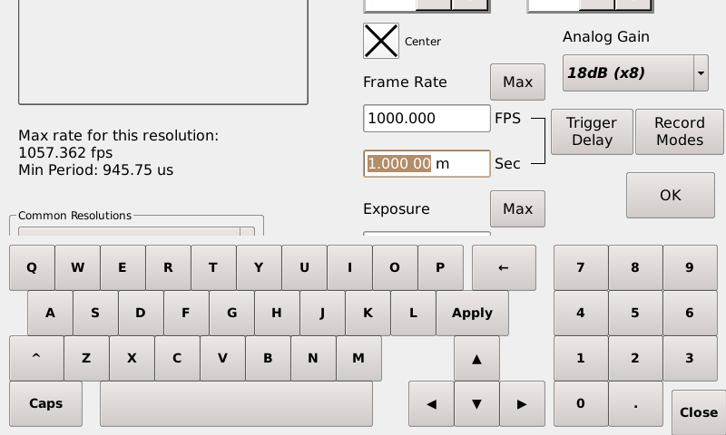
This keyboard pops up for anything needing letters input. Not bad in and of itself – the keys are quite tightly packed, there's not a lot of dead space. Yet… can we do better? 🤔
Each key is 50px² in this design.
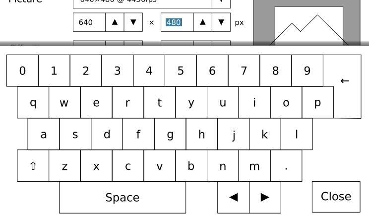
First iteration:

Better, arguably looses a bit of readability, but the buttons are bigger. The backspace key has had to be bumped into this weird place by the spacebar, though, which I'm not thrilled about. Still, on the balance, since I don't have to use backspace as much any more, maybe it works out? 😬
Notable changes:
  • Removed the caps lock key. Was anyone using it? If so, where?
  • Replaced the shift carat (^) with a shift symbol (⇧). Plus, the keyboard should switch to capital letters when you shift, so you can see what you're typing!
  • The "Apply" button, which was "Enter", is going away because I don't think you'll ever enter text but not want to apply it. Also it was very confusing.
  • The up/down arrows went away. I figure we'll use the jog wheel for that, it's faster and nicer and has tactile feedback. Plus our numeric inputs all have up/down arrows anyway. … which … I might actually want to get rid of if we're using the jog wheel.
Anyway, each key is now 60px², 20% bigger. We can do better!

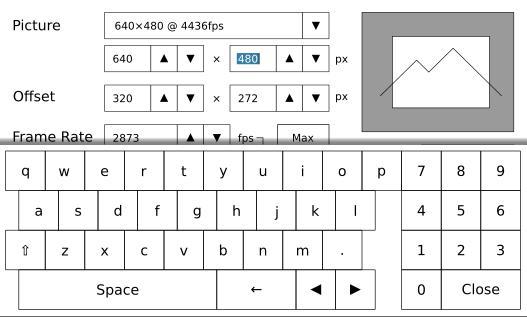
Second iteration: (Texas Mode 🤠)

The buttons are bigger yet again, and the keypad has moved up top. You can still see a sliver of the UI at the top, which is enough to be functional - if you want to input a lot of text, I think this is how you'd do it. I'm not sure if it gives enough context for little inputs, though, and it's not exactly stylish. Is it worth it for the larger keys, in your opinion?
Each key is now 70px², 40% bigger.


The numeric keypad in beta 0.3.


This keyboard pops up for number controls, starting in beta 0.3. It's got bigger keys, and nice large arrow buttons to manipulate the number and the carat with. This is a comfortable size for a button. ⅛th of a screen.
Each number key is 50×150px in this design. The arrow keys are 100px².

First iteration:

To make the buttons easier to hit, I've made them a lot taller in this version. I can't find the formula, but I seem to recall the time for selecting a button by mouse is relative to it's minimum dimension - I bet it's pretty similar for "ease of finger-tapping" too. 🙂
Each number key is 80px². This is actually less area than the beta 0.3 version, but I think it feels roomier anyway.

Second iteration:

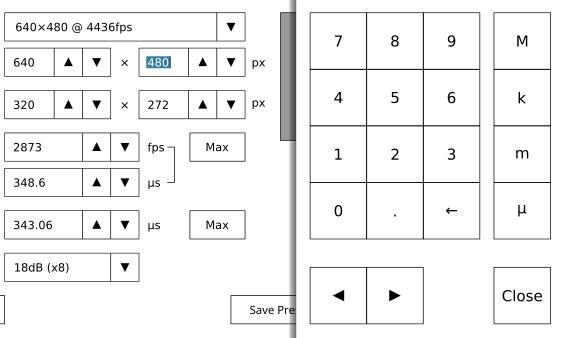
The problem with the number pad is that we can't use it for inputting into fields which have (or might have) prefixes, such as the fps field in record settings. We might need to type a k or a u in there or something. I've added those prefixes to the side, so now we can use the numeric keyboard in more places. As a bonus, it's a heck of a lot easier to enter something right since all the keys input valid things now, versus the full keyboard.
Hitting one of the unit buttons will close the keyboard, in this case, since it's always the last thing you enter. Tapping outside the keyboard will select whatever you tap on, or, if it's not selectable, close the keyboard. Hopefully.


The jog wheel.

This is a bit of a weird one, I can't really show any pictures for this. However, I'd like to describe how I'd like the jog wheel to work in beta 0.4. (Not the next release, but the one after that.)
Basically, we all agree we would like the UI to support the jog wheel. However, a full plan for that has always been, to quote a famous seer,
Quote from: 🎱
reply hazy
try again

So, I figure that we want:
  • The jog wheel to edit our inputs, when applicable. Basically numeric inputs and sliders and such.
  • The jog wheel to be able to select inputs, because operating the Chronos with gloves on requires a prosthetic finger at the moment.

The jog wheel can do two things: spin and click.
I figure the logical thing to do is keep having an unpressed spin cycle the value a little, and a pressed spin cycle the value a lot. Like on the Play screen. However, if you just click the wheel without spinning it, it'll pop you out of the control you're editing so you can select a different control or button. Click the jog wheel again to edit the new control or click the button.

Editing a number input:
I figure that numbers are editable to about ±four significant figures by just rotating the wheel. That'll actually work for just about everything, since in most cases if we're in a position to be dialing in the number we're probably not that concerned with parts per ten thousand anyway.
Alphanumeric inputs, like the saved file name, are a little harder. I think it would make the most sense to have the on-screen keyboard be controlled by the scroll wheel in that case, allowing you to select a key, tap to press it, and then select the next key. The close key would start off focused, so if you tapped the scroll wheel it would close the keyboard and put you back to 'select' mode.

Thoughts?

Pages: 1 ... 3 4 [5] 6 7 8