Show Posts

This section allows you to view all posts made by this member. Note that you can only see posts made in areas you currently have access to.


Topics - DDR

Pages: [1]
1
Software Dev / Updating the UI: Main Screen v2 + Dark Theme
« on: September 23, 2019, 06:47:09 PM »
Hello, everyone. With the new UI almost finished here, I've had time to go back and revisit the main screen design from last year. :D Updating the UI: Main Screen Edition) was one of the first things that I designed. I'm not satisfied with it any more, I think we can do better.


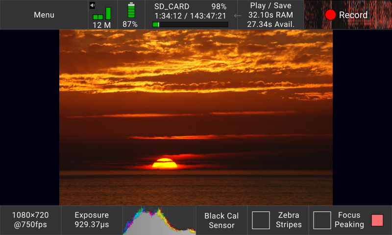
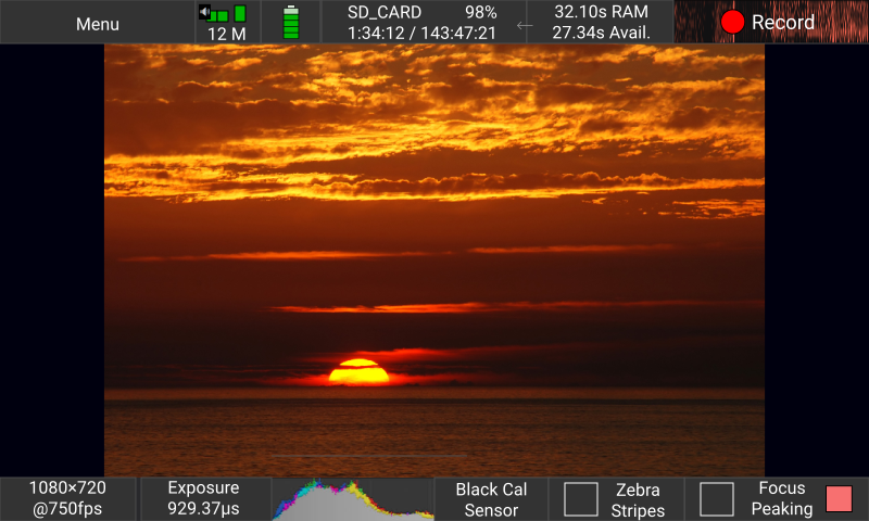
The new screen is much closer to the industry standard of "two bars, top and bottom". It is also light-on-dark, instead of the old dark-on-light colour scheme we had been running with before.


There doesn't seem to be any major difference in readability between the dark and the light version of the UI, although living in Vancouver I haven't been able to test in direct sunlight yet.

Each control, starting from top-left, works as follows:
  • Menu - Opens a drop-down list of all the screens of the camera, to access detailed functionality not on the main screen. Filterable by text, respecting most synonyms.
  • Audio levels monitor - Tap to open audio trigger configuration. Also shows audio trigger if set up. (Not shown.)
  • Battery - Tap to open power settings. Will turn red at 15% over save-and-power-down limit, will pulse red at 5% unless plugged in.
  • Save Media - Tap to open the file settings screen, to configure where files are saved to.
  • Play / Save - Tap to open an analogue of the current play and save screen. Select which region(s) of RAM to save to file.
  • Record - Start/stop a recording. Background will show recorded video in RAM as a motion heatmap in the future as pictured, if possible, as well as showing segments during segmented record mode.
  • The Picture In The Middle - Pinch to zoom. 8)
  • Resolution - Tap to open the window to set resolution, framerate, and exposure.
  • Exposure - Tap to bring up the exposure slider, as on the current main screen, and to switch between shutter angle, percent, and duration readout.
  • Spectrogram - Tap to bring up white balance screen on colour models. The spectrogram itself will be added in the future, if possible. Until then, it will be a placeholder button reading "white balance".
  • Black Cal - Tap to perform black calibration, as on the current main screen.
  • Zebra Stripes - Highlight white, as on the current main screen.
  • Focus Peaking - Highlight areas of high contrast, as on the current main screen. Tap the red square to select peaking colour. (Square will show new colour.)

I have attached a picture of the mockup on the camera, to give a sense of scale. In person, the colours generally darker, more saturated, and less aggressively blue. (But my thumb looks great!)

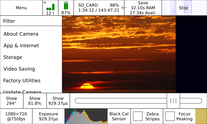
A lower-profile version is also under consideration. It gives 40px more vertical resolution to the picture, taking the total vertical resolution from 360px to 400px. (The screen itself is 480px tall by 800px wide.)


While this actually does work fine, it does squish the spectrogram and some of the labelling around play/save is lost. I prefer the chunkier UI, as it's a bit easier to read and a bit easier to tap. If we do decide to use this thinner UI, we would probably make a large spectrogram an overlay on the main screen, toggled by the smaller spectrogram button.

As always, feedback is welcome! For example, would you prefer the denser, lower-profile bars instead of the chunkier ones? Do you prefer the sidebar style of the first iteration, as it matches up with the Chronos 1.4's aspect max-resolution ratio better? What do you think of the dark colour-scheme?

2
Software Dev / Updating the UI: Network / Remote Control Screen
« on: September 21, 2018, 09:23:38 PM »
So, something I just realized here is that - now that we have Debian up and running - we need a way to configure network access. This covers HTTP for the web app, the HTTP control API itself, and SSH access to the root of the camera. Now, a word of warning - I'm a UI designer, not a network admin or security expert, so I'm actually somewhat unsure of this design. Please call me out on my mistakes.


For configuring access to the web interface, it wouldn't do if just anyone could log on to our cameras and control them by default. Someone might go and make a web page that gave you control of a random camera, and we wouldn't want that. I figure requiring a password to be set before enabling web control will avoid that problem nicely. It's also probably all we can do anyway, since anything more, such as 2-factor authentication, is much more effort and complexity than it's worth in this scenario. We may not be able to use HTTPS anyway, so whatever credentials are set will somehow wind up transmitted in plain text anyway. We can hash the password, at least, but it's still fundamentally insecure. This would be all fine over a local network without access to the internet at large, but the internet has a habit of getting into places it shouldn't. :-\ Realistically… though… it would probably be fine. But still. Sheesh. I'd like to do this properly if I can.


For SSH access to a Linux machine, given the amount of malware that's out there trying to log on to everything, best practise is to use key-based authentication. We could use a password, but I think that is inviting disaster given the sheer volume of shit that will be thrown at the camera. Since anyone wanting to SSH into the camera will probably have used SSH before, and since key-based authentication is quite common, I assume it's quite reasonable to require it to access the Chronos CLI.

We could have a password and *then* let you set up key-based authentication on your own, but I think most people will honestly just set the password and get on with whatever they need to do.

Connecting via the MiniUSB would bypass all access control. Since you have physical access, you could just reprogram the camera firmware anyway, so there's no reason to deal with any of this. :D


With all this in mind, I've mocked up two versions of a network control screen.

Version 1:


In version 1, we've laid out remote control, api access, and ssh access authentication.

Tapping on one of the SSH keys in the list will highlight it and show an X, and tapping the X will delete that key so it can't be used to log on anymore. (All keys grant access to log on as the root user. This can be changed later by logging on and setting up users as you want, if you want. Since the Chronos is running a Debian Linux under the hood in this instance, you can do whatever you'd do on a traditional server. I don't really anticipate wanting to manage users though, so I've made no allowances for it in the UI.)

I've made the screen lockable, not that it's worth very much since anyone can pop out the system MicroSD card and fiddle with the saved settings on it. I might just remove the button entirely, since perhaps it confers a false sense of security.

You can also click the underlined address to bring up a QR code. I don't like typing things in, much simpler to just scan and be taken to the mobile app. ;D

Version 2:


In version 2, which I like quite a bit more, I unified the HTTP API and web app controls. The web app uses the HTTP API to control the camera, so you can't really have one without the other. I figure if you're just using the HTTP API, it's not a big deal if the web app is being served in the background. You can just ignore it. Unifying the controls also freed up enough space to display the IPv4 and IPv6 addresses' QR codes on screen, which I think is less confusing. We don't use the underline anywhere else in the back-of-camera UI.

One alternative to this layout might be to drop IPv6 address entirely () and put a longer description in that space. It would be nice to use IPv6 to expose the cameras on the internet, though, since stable IPv4 addresses are getting harder to come by these days.

Note: The web address section only shows up after you've enabled the network interface. The "Next Address" button only shows up if there's more than one active network interface - ie, you've plugged in MicroUSB and Ethernet, and maybe WiFi if we can get it working reliably. It'll cycle through the things which are plugged in.

So, as always, please tell me you think. The best time to change designs is while they're still on the drawing board. :)

3
Software Dev / Software Roadmap - 0.3.1, 0.4.x, etc.
« on: July 31, 2018, 05:35:13 PM »
What is happening with the Chronos' software? What is in the works, and when will it be available?

Keeping in mind "The best laid plans of mice and men will often go awry", here's what we have planned:

  • 0.3.1 (expected late August)
    • Improved image demosaic for .mp4 (less colour-fringing around high contrast areas)
    • Overlay frame number on video.
    • Save .dng for raw video.
    • HDMI port supports video out.
    • Basic remote video control. (play, pause, seek)
    • Save more than 45 videos.
    • Possible raw video save speed increase.
    • Additional minor bugfixes and tweaks.

  • 0.3.x (expected mid-September)
    • Power controls (turn on when connected to power, turn off when not)
    • Basic overlay controls. Maybe.

  • 0.4.0 (expected late October)
    • Debian replaces Arago as the camera operating system.
    • Python is available to script the camera.
    • External HTTP API available for custom scripting. (may be delayed)
    • Internal D-Bus API available for custom scripting. (may be delayed)
    • UI is ported to Python, prettied up, and made to use the D-Bus API.

  • 0.4.1
    • Bugfix release for 0.4.0.
    • APIs, if delayed.

  • 0.5.0
    • Remote control app, using the HTTP API.


Behind the scenes, the main delay is that we've discovered that it's impractical to continue development using our current operating system, Arago Linux. It lacks some basics such a C compiler, a scripting language, and several basic Linux debugging utilities. Arago's video subsystem also crashes after saving 45 videos.

For example, developing the back-of-camera user interface using Arago entails a ~5-minute delay between making a change and seeing the change in the UI. Using Debian, changes made to the UI are live in seconds.

We've been working on getting Debian running, on and off, for the past year. However, a few months ago a combination of near-success and issues with Arago's video system meant we decided to officially devote engineering time to the problem. This, naturally, delayed the progress we were making on the internal D-Bus API for 0.4.0, because now we were working on something else.

Currently, from my user-interface-centric perspective, here is how our progress is looking for version 0.4.0. The new UI and APIs will be debuted when this is complete.


tap for full resolution ↗️


Green means "completed", yellow is "in progress". Arrows show what depends on what. For example, the final implementation on the right depends on the D-Bus API, which has had the video control component made, and the D-Bus API Mock, which is currently being developed. Implementation is done by adding behaviour to a laid-out UI (labelled "Shell & Nav"), which I sketch up in Designer as a separate step. Each screen can be done more or less independently.

I hope this helps clear things up. I'll try to keep this thread updated as things progress. One of the big reasons we don't like to announce things is that they frequently turn out to simply be untrue. For example, we thought we'd fixed raw save speed, but then it turned out we hadn't a few times. We really don't want to promise something we won't deliver on, so we keep to ourselves quite frequently. What are your thoughts on this?

4
Software Dev / Updating the UI: Motion trigger configuration
« on: July 19, 2018, 07:53:24 PM »
In a previous post, some time ago, I'd drawn up a revised triggers screen. I've produced a revised version for (hypothetical) motion triggering.

Trigger action screen:


Most of the modifiers for the electrical triggers don't apply any more, so they've been removed. A live preview of the motion trigger area has been added in. The active area can be dragged around like on the recording settings screen. Clicking the Configure button below it brings us to the motion trigger configuration screen.


Motion Trigger Configuration


Instead of describing how the motion trigger configuration screen works, I'd like to hear how you think it should work. Most people will be coming to this screen without foreknowledge when they're using the camera. First impressions matter! :)

5
One of the more often requested features for the Chronos is the ability to see exact timing information, so you can figure out when an event occurred relative to a trigger. This is especially useful for trigger modes where the framerate may not be consistent, such as with shutter gating.


I've designed two screens. The first and the simplest is what I'm intending to include in the initial version of the redesigned UI. I think it covers most of the use-cases, and it's a lot simpler to implement.

(I'm not sure why the arrows on the number inputs got rendered as "a"s. They should just be up/down wedges. 🤷)


The second is a more advanced screen, which exposes more of the hardware capabilities. It would only be useful if we had more than three options, or if there were a solid use-case for having the flexibility to format timing and frame count.


The %percent-key% format would let you burn metadata into the video for easy consumption, since not every video player displays metadata so well. (eg., the pictured "Trg: %TimeFromTrigger%" would actually print something like "Trg: +204515.1ns" in the corner of a saved frame of video.) If in the future we capture metadata on a per-frame basis, then we'll have a bunch of fields which would be quite amenable to this interface.

In both screens, images are pulled from the root folder of a USB stick you insert. (We might get a proper file-browser some day, as part of an on-camera footage management and review system.)


As always, please let me know your thoughts on the matter. If I've missed anything you would find important, now is the best time to let me know. :)

6
Software Dev / Updating the UI: Battery
« on: July 18, 2018, 08:56:40 PM »
On the redesigned main screen, if you tap the battery icon, you'll get to a screen for battery and power. As with most of my mockups, this comes with a caveat: this is what we want. This is not necessarily what we'll get. ;)


7
Software Dev / Updating the UI: Input Methods Edition
« on: March 23, 2018, 07:58:53 PM »
Hello, everybody! The software manual for beta 0.3 is mostly done now, so I'm had time to mock up a few possibilities for keyboards. First up:


The standard keyboard for the upcoming beta 0.3.


This keyboard pops up for anything needing letters input. Not bad in and of itself – the keys are quite tightly packed, there's not a lot of dead space. Yet… can we do better? 🤔
Each key is 50px² in this design.

First iteration:

Better, arguably looses a bit of readability, but the buttons are bigger. The backspace key has had to be bumped into this weird place by the spacebar, though, which I'm not thrilled about. Still, on the balance, since I don't have to use backspace as much any more, maybe it works out? 😬
Notable changes:
  • Removed the caps lock key. Was anyone using it? If so, where?
  • Replaced the shift carat (^) with a shift symbol (⇧). Plus, the keyboard should switch to capital letters when you shift, so you can see what you're typing!
  • The "Apply" button, which was "Enter", is going away because I don't think you'll ever enter text but not want to apply it. Also it was very confusing.
  • The up/down arrows went away. I figure we'll use the jog wheel for that, it's faster and nicer and has tactile feedback. Plus our numeric inputs all have up/down arrows anyway. … which … I might actually want to get rid of if we're using the jog wheel.
Anyway, each key is now 60px², 20% bigger. We can do better!

Second iteration: (Texas Mode 🤠)

The buttons are bigger yet again, and the keypad has moved up top. You can still see a sliver of the UI at the top, which is enough to be functional - if you want to input a lot of text, I think this is how you'd do it. I'm not sure if it gives enough context for little inputs, though, and it's not exactly stylish. Is it worth it for the larger keys, in your opinion?
Each key is now 70px², 40% bigger.


The numeric keypad in beta 0.3.


This keyboard pops up for number controls, starting in beta 0.3. It's got bigger keys, and nice large arrow buttons to manipulate the number and the carat with. This is a comfortable size for a button. ⅛th of a screen.
Each number key is 50×150px in this design. The arrow keys are 100px².

First iteration:

To make the buttons easier to hit, I've made them a lot taller in this version. I can't find the formula, but I seem to recall the time for selecting a button by mouse is relative to it's minimum dimension - I bet it's pretty similar for "ease of finger-tapping" too. 🙂
Each number key is 80px². This is actually less area than the beta 0.3 version, but I think it feels roomier anyway.

Second iteration:

The problem with the number pad is that we can't use it for inputting into fields which have (or might have) prefixes, such as the fps field in record settings. We might need to type a k or a u in there or something. I've added those prefixes to the side, so now we can use the numeric keyboard in more places. As a bonus, it's a heck of a lot easier to enter something right since all the keys input valid things now, versus the full keyboard.
Hitting one of the unit buttons will close the keyboard, in this case, since it's always the last thing you enter. Tapping outside the keyboard will select whatever you tap on, or, if it's not selectable, close the keyboard. Hopefully.


The jog wheel.

This is a bit of a weird one, I can't really show any pictures for this. However, I'd like to describe how I'd like the jog wheel to work in beta 0.4. (Not the next release, but the one after that.)
Basically, we all agree we would like the UI to support the jog wheel. However, a full plan for that has always been, to quote a famous seer,
Quote from: 🎱
reply hazy
try again

So, I figure that we want:
  • The jog wheel to edit our inputs, when applicable. Basically numeric inputs and sliders and such.
  • The jog wheel to be able to select inputs, because operating the Chronos with gloves on requires a prosthetic finger at the moment.

The jog wheel can do two things: spin and click.
I figure the logical thing to do is keep having an unpressed spin cycle the value a little, and a pressed spin cycle the value a lot. Like on the Play screen. However, if you just click the wheel without spinning it, it'll pop you out of the control you're editing so you can select a different control or button. Click the jog wheel again to edit the new control or click the button.

Editing a number input:
I figure that numbers are editable to about ±four significant figures by just rotating the wheel. That'll actually work for just about everything, since in most cases if we're in a position to be dialing in the number we're probably not that concerned with parts per ten thousand anyway.
Alphanumeric inputs, like the saved file name, are a little harder. I think it would make the most sense to have the on-screen keyboard be controlled by the scroll wheel in that case, allowing you to select a key, tap to press it, and then select the next key. The close key would start off focused, so if you tapped the scroll wheel it would close the keyboard and put you back to 'select' mode.

Thoughts?

8
Software Dev / Updating the UI: Play & Save Edition
« on: February 26, 2018, 04:38:38 PM »
I've redesigned the current playback screen. This is a more theoretical design, since I'm not sure we will actually be able to do what we want to do. (I think it's important that we know what we want to, though, so we can explicitly deal with not being able to do it.)


I've only made up one version of this screen. It's a pretty direct iteration on what we have now; we've got the same controls along the side, in pretty much the same layout. However, we've added two major features:
  • A seek bar along the bottom to take advantage of the increased horizontal resolution there. The seek bar will display the colour of the middle column of pixels of the frame of video under that position on the bar. This should help you spot motion when you're reviewing footage and trying to find where the moment the interesting bit happened is. Also, it's nice and big and has a slider that lets you see the bar pattern. ;D
  • Multiple marked regions. Regions show up as different coloured boxes near the top of the timeline. They're red and yellow in the mockup. Right now, when you mark in and mark out, you have to wait for the region to save before marking and saving the next region you want. Having multiple regions should fix that. 8)

Since all this UI does eat into the video window a bit, we are planning to let you zoom the video itself in and out with pinch-to-zoom. (And tap-tapdrag like on Android phones? It's a little hard to discover but I really like it. What does iOS have to say about this? Hmm... 🤔 )


If you hit the "Edit Marked Regions" button in the top-left, it slides out a menu:


This lets you delete regions, rename regions (which will be reflected in the saved file name), and modify region start/end. I'm a little fuzzy on how closing the box will work. I think 'swipe left to close' would work, or tapping on 'edit marked regions' again. If it turns out to be confusing, we can always add an ✕ to the top-right of the menu to make it nice and explicit. :)

9
Software Dev / Updating the UI: Record Settings Edition
« on: February 23, 2018, 04:17:51 PM »
The recording settings screen is one of the busier screens on the camera. I've made a few different layouts for it.

Version A:


You will be able to drag the white window around to frame up whatever you have the camera pointed at. We ought be able to get a live video feed from the main screen stuck behind it too, so you can see what you're going to record. Much better to see than to guess!

Does anyone mind the passepartout around the preview just being always present? Every other piece of software I've worked with has had an option to turn it off, but I really don't want to have to stick another option in the settings screen for this.

Version B:


We managed to get the analog gain button and the exposure button on the same line in this version. Analog Gain was sort of floating off to the right in Version A, I feel.

Oh, in all versions, I moved the trigger delay settings button to the Main screen. (I also put a button on the Trigger/IO Settings screen, it seemed logical.) I figure if you're trying to dial something in, timing-wise, you'll want to access the trigger delay screen quite frequently.

Version E:


I'm ambivalent about this version. I actually like Version B a little better, it's got a nicer vertical rhythm with its whitespace. In both B and E, the trigger delay button has gone to the more standard bottom-left corner of the screen. I expect we'll want to put another button on this screen someday though and the Trigger Delay will go back to being by the Done button. ::)


As always, if you have any ideas or comments, please leave them below.
Thanks for reading!

[edit] Fixed version B being the screenshot for version E. :-[ Oops. [/edit]

10
Software Dev / Updating the UI: Main Screen Edition
« on: February 22, 2018, 11:12:03 PM »
Hey guys! I've finally got the wireframe-ish mockups I've been making into a presentable shape. I've made a few versions of a future main screen I'd love to get some feedback on. 8)

Here's an early iteration, Version A.


Version A in record mode. (The blue ring is how much memory you have left to record in to.)


After some discussion internally, this resulted in Version B, where the text moved out onto the image and the record button moved into the sidebar beside the play and save screen button.


Then patrickrebstock, somewhat unintentionally, inspired me to try switching around some of the buttons to put the most-used ones on the left side. (Or the right side, if you check that checkbox in Prefs. & Utilities.) I'm loosely preferential to the easy thumb reach in this version, though I think it was better organized in Version B. All the menus-buttons were on the right there, all the action-buttons were on the top.

Version C:


Anyway, if y'all have any thoughts, I'd love to hear them! I really need some feedback on my work - Krontech is nice, but there's only so many people I can bother here. ;)

11
Software Dev / Updating the UI
« on: February 07, 2018, 11:18:21 PM »
Hello, all. David hired me a few days back to improve our UI. (This includes the lack of a mobile app.) I've been getting my bearings with the software, and I've mocked up few screens I'd like to get some feedback on. Nothing's final yet; I'm still learning my way around the project and figuring out how to change things. :)


Main Screen:
  • I've made all the font sizes on the main menu the same. I think it looks a lot better, but it's also harder to read. I'm going to try to move some things around later to make the buttons a lot larger and more legible.
  • I've added "..." to buttons that open up a menu. Is this something you yourself would reasonably expect "..." to mean?
  • I reordered the buttons on the main screen. All the settings are together at the bottom now!
  • Changed "Play" to "Review and Save". (It could as easily be "Play and Save". I didn't think you'd intuitively look under "Play" to save your work. 🤔
  • Aligned all the things.


Play Screen:
  • Mostly just changed around the arrows here. Up/down now move the slider up and down. Plus and minus adjust the speed of the up and down. Much more sensible than having up and down adjust the speed of left and right. :D
  • Not that it's quite in yet, but "mark in" and "mark out" will become more like "mark a" and "mark b". Regardless of which is first, when you save, it'll just take the segment between the two. We'd like to get actual marks drawing on the slider as well.


Anyway, that's it for now! Thanks for reading!

Pages: [1]