Show Posts

This section allows you to view all posts made by this member. Note that you can only see posts made in areas you currently have access to.


Messages - DDR

Pages: 1 ... 5 6 [7] 8
91
Software Dev / Re: Updating the UI: Play & Save Edition
« on: February 27, 2018, 07:25:13 PM »
I was figuring that whatever you caught the video of would move through the middle frame, so you'd be able to see when the event occurred by looking for the change in colour along the film strip. I was sort of banking on having steady shots, because - I think - you could better see when the event is then. What use-case did you have in mind, jasonfish?

92
Software Dev / Re: Updating the UI: Record Settings Edition
« on: February 26, 2018, 09:31:16 PM »
Hm, yeah, that actually works pretty nicely when I try it out properly.


I made a second version because I didn't want to loose the label. I suspect that, if I put my ego aside, it could indeed be lost. I like the first version a bit more, graphically. :)

93
Software Dev / Re: Updating the UI: Main Screen Edition
« on: February 26, 2018, 09:18:08 PM »
That's... not a bad idea, we do only need it for zoom...

I would like to keep consistency with the playback screen, and I suspect there's too many tappable things already on the playback screen to do that there. Still... dang, yeah, that would be nice. It doesn't really conflict with pinch-to-zoom either. :D

94
Software Dev / Re: Updating the UI: Play & Save Edition
« on: February 26, 2018, 09:11:19 PM »
Wait, we'll be able to save multiple sections of the same recording? Will they be saved as separate files, or stitched together?
They'll be saved as multiple files.

My only feedback on the screenies: The + and - speed buttons appear to be reversed.
Well, I'll be. You're totally right. I've fixed them now -- thank you for catching that.

Here's the fixed version. :)

95
more jog dial control would be nice

Yesssss. We have plans. 8)

There will be a little more control in the next release, and hopefully full control with the new UI I've been working on. Hopefully.

96
Software Dev / Re: Updating the UI: Main Screen Edition
« on: February 26, 2018, 06:54:24 PM »
Something like this?

Version E

(The Auto button, here, would set the slider as high as it could go without clipping. It wouldn't be exclusive to this particular design, probably. It's just that I only now remembered it.)

The reason I'd wanted pinch-to-zoom was to let you focus the camera. Right now, if you're shooting at 1280x1024px, you're looking at a viewport 600x480px wide while you try to focus the image. By letting you zoom in, you could see how sharp your focus really was. It wouldn't change what the camera recorded. However, I think this might have quite some confusion potential as the camera suddenly isn't recording what it's showing. I don't have any great ideas how to fix this, actually - can you think of anything? :-\

I do agree that multi-touch is hard to discover. I think we should support pinch-to-zoom though because it's pretty standard - everything with a touch screen that supports zooming supports pinch-to-zoom. However, that's the only multi-touch gesture I'd want to implement. You could also zoom with one finger if you tap-tapdrag, if you wanted. Or just ignore the zooming altogether, which is what we have now.

97
Software Dev / Re: Updating the UI: Record Settings Edition
« on: February 26, 2018, 05:20:02 PM »
I like that idea. We could add a saved preset to the list of presets at the top, and then have little ✕s to remove the custom presets. I don't think you'd need much more than that, and it would be a nice feature to have.  :)

Internally here, we've had some discussion about adding some sort of camera-wide presets. You'd set them from the app that we're going to make. They'd essentially save/restore *all* the settings on the camera, though, which isn't quite what we want here. I think that's going to come after we release the new style UI, so I think it would be a good idea for me to have a look at adding custom presets then. Internally, we've got 0.4 coming up, and then 0.5 will have the new-style UI, and 0.6 will probably be when we address saving/loading custom settings.

98
Software Dev / Re: Updating the UI: Main Screen Edition
« on: February 26, 2018, 05:00:22 PM »
So it shall be!
And so it is. :)


Version D


C also works for me, based on a quick glance and think.
I'm hoping that the new playback screen will move the position slider to the bottom of the screen to give both more space and keep fingers out of the way.
So I'm wondering if doing the same for the Shutter would also be a good idea as the imagines tend to be long and narrow rather than tall and thin.
Thanks!

Yeah, I'd really like to have a bottom slider on the playback screen too. I've drawn up some designs with that in mind... what you think, Electra? :D

I'm hoping that pinch-to-zoom on the video will make the side shutter slider acceptable. It's a lot more accessible by thumb there, and we don't usually need the fine-grained control over the shutter that we do when we're reviewing footage. Plus, we'll be able to do fine-grained shutter adjustments with the jog wheel soon!

99
Software Dev / Updating the UI: Play & Save Edition
« on: February 26, 2018, 04:38:38 PM »
I've redesigned the current playback screen. This is a more theoretical design, since I'm not sure we will actually be able to do what we want to do. (I think it's important that we know what we want to, though, so we can explicitly deal with not being able to do it.)


I've only made up one version of this screen. It's a pretty direct iteration on what we have now; we've got the same controls along the side, in pretty much the same layout. However, we've added two major features:
  • A seek bar along the bottom to take advantage of the increased horizontal resolution there. The seek bar will display the colour of the middle column of pixels of the frame of video under that position on the bar. This should help you spot motion when you're reviewing footage and trying to find where the moment the interesting bit happened is. Also, it's nice and big and has a slider that lets you see the bar pattern. ;D
  • Multiple marked regions. Regions show up as different coloured boxes near the top of the timeline. They're red and yellow in the mockup. Right now, when you mark in and mark out, you have to wait for the region to save before marking and saving the next region you want. Having multiple regions should fix that. 8)

Since all this UI does eat into the video window a bit, we are planning to let you zoom the video itself in and out with pinch-to-zoom. (And tap-tapdrag like on Android phones? It's a little hard to discover but I really like it. What does iOS have to say about this? Hmm... 🤔 )


If you hit the "Edit Marked Regions" button in the top-left, it slides out a menu:


This lets you delete regions, rename regions (which will be reflected in the saved file name), and modify region start/end. I'm a little fuzzy on how closing the box will work. I think 'swipe left to close' would work, or tapping on 'edit marked regions' again. If it turns out to be confusing, we can always add an ✕ to the top-right of the menu to make it nice and explicit. :)

100
Software Dev / Re: Updating the UI: Record Settings Edition
« on: February 26, 2018, 04:25:15 PM »
Like this?


101
Software Dev / Re: Updating the UI: Record Settings Edition
« on: February 26, 2018, 03:35:49 PM »
B and E are the same file :)

So they are! :-[ Sorry about that! Version E was correct. Version B has become, well, Version B now. Thanks for catching that.

Here is the proper version B. I've updated in in the original post as well.


While 'B' looks better, I'd be a little worried about fat-fingering the other controls when changing a setting, but if this is not a problem in the real world then go for that.
I'm hoping it'll be OK. The new controls are a little chunkier than the old ones, so they should be easy to hit. If it turns out it's not, I'll redo the screen. (Maybe it can scroll vertically, like a web page, if it is really bad?)

You also have a bit more space to work with: move the 'trigger delay' button to the 'trigger' menu/page where it belongs. Not on the recording screen. :)
*checks notes* ??? You're right! It should be a button for record modes, not trigger delay! Trigged delay absolutely belongs somewhere else. Thanks for catching that. I've fixed the button in the image above.


I prefer version A mainly because it's more clear, version B is more cluttered.
i kinda like A because its more logical to have the presets resolution above the resolution up down controls
OK, I uploaded the *proper* version B now. I agree with you, E does seem less well organized to me.

102
Software Dev / Updating the UI: Record Settings Edition
« on: February 23, 2018, 04:17:51 PM »
The recording settings screen is one of the busier screens on the camera. I've made a few different layouts for it.

Version A:


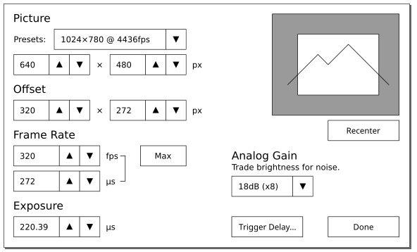
You will be able to drag the white window around to frame up whatever you have the camera pointed at. We ought be able to get a live video feed from the main screen stuck behind it too, so you can see what you're going to record. Much better to see than to guess!

Does anyone mind the passepartout around the preview just being always present? Every other piece of software I've worked with has had an option to turn it off, but I really don't want to have to stick another option in the settings screen for this.

Version B:


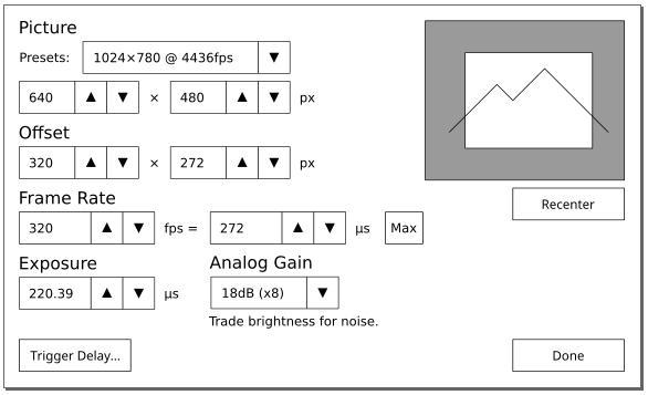
We managed to get the analog gain button and the exposure button on the same line in this version. Analog Gain was sort of floating off to the right in Version A, I feel.

Oh, in all versions, I moved the trigger delay settings button to the Main screen. (I also put a button on the Trigger/IO Settings screen, it seemed logical.) I figure if you're trying to dial something in, timing-wise, you'll want to access the trigger delay screen quite frequently.

Version E:


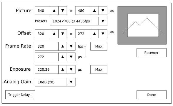
I'm ambivalent about this version. I actually like Version B a little better, it's got a nicer vertical rhythm with its whitespace. In both B and E, the trigger delay button has gone to the more standard bottom-left corner of the screen. I expect we'll want to put another button on this screen someday though and the Trigger Delay will go back to being by the Done button. ::)


As always, if you have any ideas or comments, please leave them below.
Thanks for reading!

[edit] Fixed version B being the screenshot for version E. :-[ Oops. [/edit]

103
Software Dev / Re: Updating the UI: Main Screen Edition
« on: February 23, 2018, 03:02:32 PM »
version c but maybe with a few tweaks,
switch record settings with the white balance,
switch the prefs & utilities with black balance

that way all camera settings are across the top where not used as much and then the right hand side is all the buttons used while shooting

Seconded

So it shall be!

(I'm kinda snowed in right now, so I must make my modified mockup Monday.)

104
Software Dev / Updating the UI: Main Screen Edition
« on: February 22, 2018, 11:12:03 PM »
Hey guys! I've finally got the wireframe-ish mockups I've been making into a presentable shape. I've made a few versions of a future main screen I'd love to get some feedback on. 8)

Here's an early iteration, Version A.


Version A in record mode. (The blue ring is how much memory you have left to record in to.)


After some discussion internally, this resulted in Version B, where the text moved out onto the image and the record button moved into the sidebar beside the play and save screen button.


Then patrickrebstock, somewhat unintentionally, inspired me to try switching around some of the buttons to put the most-used ones on the left side. (Or the right side, if you check that checkbox in Prefs. & Utilities.) I'm loosely preferential to the easy thumb reach in this version, though I think it was better organized in Version B. All the menus-buttons were on the right there, all the action-buttons were on the top.

Version C:


Anyway, if y'all have any thoughts, I'd love to hear them! I really need some feedback on my work - Krontech is nice, but there's only so many people I can bother here. ;)

105
Software Dev / Re: Updating the UI
« on: February 22, 2018, 09:44:10 PM »
No! I totally missed the edit. Thanks for pointing it out!

-----

What a good video! This is really interesting, we do hold the camera differently. Your left thumb tends to be on the top, while I tend to put my left thumb on the bottom. 🤔

Thank you.

Pages: 1 ... 5 6 [7] 8