Hey guys! I've finally got the wireframe-ish mockups I've been making into a presentable shape. I've made a few versions of a future main screen I'd love to get some feedback on.

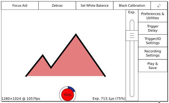
Here's an early iteration,
Version A.

Version A in record mode. (The blue ring is how much memory you have left to record in to.)

After some discussion internally, this resulted in
Version B, where the text moved out onto the image and the record button moved into the sidebar beside the play and save screen button.

Then patrickrebstock, somewhat unintentionally, inspired me to try switching around some of the buttons to put the most-used ones on the left side. (Or the right side, if you check that checkbox in Prefs. & Utilities.) I'm loosely preferential to the easy thumb reach in this version, though I think it was better organized in Version B. All the menus-buttons were on the right there, all the action-buttons were on the top.
Version C:

Anyway, if y'all have any thoughts, I'd love to hear them! I really need some feedback on my work - Krontech is nice, but there's only so many people I can bother here.
