Author Topic: Updating the UI: Main Screen Edition  (Read 61356 times)

patrickrebstock

  • Full Member
  • ***
  • Posts: 114
  • playing camera
    • View Profile
    • patrickrebstock.com
Re: Updating the UI: Main Screen Edition
« Reply #15 on: February 27, 2018, 07:19:00 AM »
but if i can control the exposure with the jog dial that would be my favorite! :)

BiduleOhm

  • Jr. Member
  • **
  • Posts: 85
    • View Profile
Re: Updating the UI: Main Screen Edition
« Reply #16 on: February 27, 2018, 11:25:17 AM »
I don't see any problem with pinch to zoom and drag to pan; with all the smartphones and tablets now it's pretty much "touch screen + image = pinch and drag" in everyone's brain, and there's also the manual for the few % who might have missed that.

And we can always add a click to toggle the zoom level, it's not mutually exclusive with the pinch to zoom AFAIK.

DDR

  • Krontech
  • Full Member
  • *****
  • Posts: 111
    • View Profile
    • Krontech
Re: Updating the UI: Main Screen Edition
« Reply #17 on: February 27, 2018, 09:31:55 PM »
Tap to zoom would be perfectly fine for quick double-check-focus actions. But then again, that's assuming that one's focus point is in the center of the frame. If not, one would need to tap to zoom, then drag to recenter on the focus point. So maybe pinch-zoom-pan is the only universally usable option.

I like simplicity of code, but now I'm torn. :)
We'd probably want to make it zoom in on wherever you tapped.


One way around pinch to zoom, assuming there is room to add them, would be a 'zoom in/out' button pair then 'drag' to pan around would work.
Agreed.

Maybe, depending on what others think, you can have 'focus aids' and that would invert/depress the button and replace recording settings/play+save with 'zoom in/out'  'zebra toggle' 'focus aid level'   etc. and show that your in a different viewing mode?   Would adding this extra step get in the way of other's workflow?
I think it would be OK. Especially with a predictable opening position, sub-menus are quite quick once you are familiar with them.

Currently, I only have one sub-menu in the design. The Focus Aid button's settings got brought out of the Util screen. It will make it one more tap, or at least a more complex tap, to toggle Focus Aid. But I think it's worth it to be able to see what the settings you're setting are doing.


I'm going to have to play around with it a little more before I know exactly how interaction will be. I'll do whatever feels natural to me, but it'll probably be something like 'tap outside the menu to close it, tap inside to press buttons on it'. Nothing too wild. I am considering, if you drag onto the menu, it auto-closes when you release... but I think that might be 'nice but weird', which I don't really like. Like I said, I'll have to play around with it.

patrickrebstock

  • Full Member
  • ***
  • Posts: 114
  • playing camera
    • View Profile
    • patrickrebstock.com
Re: Updating the UI: Main Screen Edition
« Reply #18 on: February 27, 2018, 10:14:18 PM »
i dont see anyone having problems with pinch to zoom, that would be a wonderful interaction and then drag around zoomed in area.

with the set White balance, how will setting a degree kelvin work? rather than the custom wb that we have now

Electra

  • Jr. Member
  • **
  • Posts: 55
    • View Profile
Re: Updating the UI: Main Screen Edition
« Reply #19 on: February 27, 2018, 11:12:38 PM »
I would have zero issue with it being *in addition to* zoom in/out buttons. It's a great short cut that many people seem comfortable with or want it.
(I don't really like it myself, having dealt with the frustration of old/damaged/dirty(or heavily protected) gear not registering the second finger/dropping touches/etc. Trying to hold a large/heavy device in two hands while doing multi-tap is a pain. If it's set up on a light tripod or balanced atop something to set up the shot.)

One thought: Mentioned in another thread is that someone would like the ability to use the camera with an external HDMI screen and a mouse. I can imagine this being a very useful feature(Much like being able to plug a mouse into an android smartphone and having it bring up a cursor).

You suggested 'tap to zoom'.  That alone might be enough. Set it so if you tap the image, wherever you tap would zoom in to a magnified view on that spot.(With big 'zoomed in' text)  Tap again returns to normal view. So you can quickly tap-zoom/tap-unzoom a few spots. It would simplify the interaction and also do the same thing.

The final designs would need to be tested though for what 'feels right' as you said.  These are all just ideas.

And I keep forgetting to mention it. I like the 'exposure changed' reminder. That is a nice(if unrelated) touch.

patrickrebstock

  • Full Member
  • ***
  • Posts: 114
  • playing camera
    • View Profile
    • patrickrebstock.com
Re: Updating the UI: Main Screen Edition
« Reply #20 on: February 28, 2018, 07:42:43 AM »
on the exposure changed thought, when is the black calibration going to be faster like it says in future versions of firmware, is this being worked on for next version?

DDR

  • Krontech
  • Full Member
  • *****
  • Posts: 111
    • View Profile
    • Krontech
Re: Updating the UI: Main Screen Edition
« Reply #21 on: February 28, 2018, 02:05:42 PM »
I would have zero issue with it being *in addition to* zoom in/out buttons. It's a great short cut that many people seem comfortable with or want it.
(I don't really like it myself, having dealt with the frustration of old/damaged/dirty(or heavily protected) gear not registering the second finger/dropping touches/etc. Trying to hold a large/heavy device in two hands while doing multi-tap is a pain. If it's set up on a light tripod or balanced atop something to set up the shot.)
That is a mighty good point, and one I hadn't thought of. Thank you for bringing it up.

One thought: Mentioned in another thread is that someone would like the ability to use the camera with an external HDMI screen and a mouse. I can imagine this being a very useful feature(Much like being able to plug a mouse into an android smartphone and having it bring up a cursor).
After I've implemented the restyled back-of-camera interface, I'll be making a dedicated app you can run on a computer or cellphone. It'll have good mouse support. :)

And I keep forgetting to mention it. I like the 'exposure changed' reminder. That is a nice(if unrelated) touch.
Thanks!  ;D


on the exposure changed thought, when is the black calibration going to be faster like it says in future versions of firmware, is this being worked on for next version?
Right now, we've got it down to 4 seconds for max resolution, and more or less instantaneous at low resolutions.

We've got a few ideas to make it effectively instantaneous, at which point we'll remove the little reminder popup and just perform software black cal when we need to. (This probably won't make it into the next release though.)

BiduleOhm

  • Jr. Member
  • **
  • Posts: 85
    • View Profile
Re: Updating the UI: Main Screen Edition
« Reply #22 on: February 28, 2018, 02:21:51 PM »
Right now, we've got it down to 4 seconds for max resolution, and more or less instantaneous at low resolutions.

We've got a few ideas to make it effectively instantaneous, at which point we'll remove the little reminder popup and just perform software black cal when we need to. (This probably won't make it into the next release though.)

Wow, that's impressive! Good job on that ;)

DDR

  • Krontech
  • Full Member
  • *****
  • Posts: 111
    • View Profile
    • Krontech
Re: Updating the UI: Main Screen Edition
« Reply #23 on: February 28, 2018, 04:49:10 PM »
Thanks! Credit where credit is due: it's pretty much all Loial's doing. 8)

patrickrebstock

  • Full Member
  • ***
  • Posts: 114
  • playing camera
    • View Profile
    • patrickrebstock.com
Re: Updating the UI: Main Screen Edition
« Reply #24 on: March 17, 2018, 03:47:06 PM »
Great news on Black call

DDR

  • Krontech
  • Full Member
  • *****
  • Posts: 111
    • View Profile
    • Krontech
Re: Updating the UI: Main Screen Edition
« Reply #25 on: July 23, 2018, 07:49:00 PM »
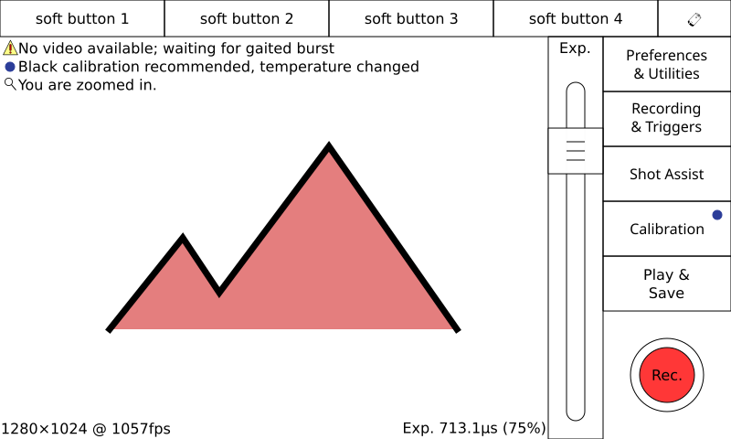
OK, time to perform some thread necromancy here and revive this topic. Design requirements have changed somewhat with the addition of soft buttons.


First up, we have the upper row of (fixed) buttons replaced by soft buttons. I'm thinking these should default to Recording Settings, Trigger/IO, Trigger Delay, and Prefs & Utils. However, as we see people use the camera, we will refine these defaults. I don't really know how they will be used at the moment.

The soft buttons would be configured in the utils menu, and perhaps by long-tap. (Long taps are terrible to discover, so there needs to be a backup. And no one reads the manual. :P)

Mockup 7:


The buttons along the side now slide out menus. Tapping a button will slide the entire right panel to the left to make room for the opened panel. This means your finger is over whatever you're about to tap on, but it does mean muscle memory is somewhat more situational than it was. The alternative is to pop the opened panel up to the left (or on top of) of the exposure slider. Less prone to accidental clicks, and nothing has to move around. :)

The buttons are mapped as follows:
  • Preferences& Utilities: Open up the preferences window as before. Since this window is complex enough as is, I don't think it should be hidden behind a menu.
  • Recording & Triggers: Opens up a panel with buttons to open trigger io settings, trigger delay, record modes, and record settings.
  • Shot Assist: Similar to the mockup attached in the first post, this dialog lets you configure focus aid as well as enable zebra stripes.
  • Calibration: Set white balance and perform black cal. on colour models. If you have a black-and-white model, this calibration menu will be replaced with the black cal button.


Mockup 8:
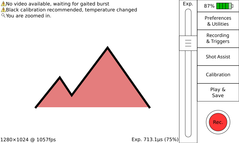

As an alternative to having default soft buttons, we could have no soft buttons at all until they are configured in the Utils screen. This makes the main screen design less cluttered when the camera is first encountered, and gives a bit more room for video to be displayed.


As a side note, in the future soft buttons could be extended to include the vertical column of buttons as well as the top row. You'd probably have a list of options and configurations they could activate, and by checking them you could build up a menu. There's quite a lot of possibility here. Perhaps long-tapping on any button lets you select it as a soft button? Perhaps the entire home screen could be surrounded by soft buttons if you wanted. Perhaps there could be multiple, customizable screens.

Schedule-wise, the first mockup, mockup 7, may make it into the initial release of the new UI. However, anything else will have to come later due to time constraints.

As always, please let me know what you think. Your feedback has a huge influence on the design of the Chronos UI! :D
« Last Edit: July 23, 2018, 07:55:44 PM by DDR »

BiduleOhm

  • Jr. Member
  • **
  • Posts: 85
    • View Profile
Re: Updating the UI: Main Screen Edition
« Reply #26 on: July 24, 2018, 03:35:00 AM »
You have very good ideas :D

Of course if we can have all the buttons as customizable soft buttons it would be great.

And I think the battery icon should always be displayed (even when there's buttons on the top row).

NiNeff

  • Full Member
  • ***
  • Posts: 169
    • View Profile
Re: Updating the UI: Main Screen Edition
« Reply #27 on: July 24, 2018, 09:57:52 AM »
Definitively Version 8 over 7!
I also like the clear battery icon, you can see at one glance what it means and how full the battery is.
Not cluttering the screen with buttons is also a good idea. If someone wants them they can configure and add their own, and everything is packed neatly into their own menues where it belongs.
However this needs to be finely balanced, Too little buttons has you searching for vital settings over and over again while too much is just confusing and reducing the screenspace for the video preview. Therefore a small default with custom additions would be a great solution for almost all usecases.
« Last Edit: July 25, 2018, 08:24:12 AM by NiNeff »

Fyodor

  • Jr. Member
  • **
  • Posts: 60
    • View Profile
Re: Updating the UI: Main Screen Edition
« Reply #28 on: July 24, 2018, 10:33:55 PM »
I'm totally with NiNeff!

DDR

  • Krontech
  • Full Member
  • *****
  • Posts: 111
    • View Profile
    • Krontech
Re: Updating the UI: Main Screen Edition
« Reply #29 on: July 25, 2018, 05:25:13 PM »
Let's roll with V8 then. 8)